LUKS Group: Headless Drupal Multi-site Redesign
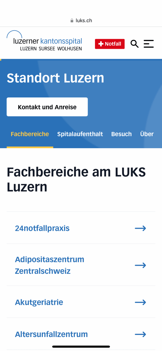
As a leading hospital group, LUKS employs new digital technologies to increase efficiency and meet the major challenges in healthcare. The project relaunched the two independent sites, and the frontends underwent a redesign. The websites of the Lucerne Cantonal Hospital and the Nidwalden Hospital are mainly used for communication with patients, their families, general practitioners, specialists, as well as job seekers.
The holistic relaunch and decoupling of existing Drupal websites - www.luks.ch and www.spital-nidwalden.ch focused on two key areas - a fresh frontend experience and improving reliability.
Project Services:
UX Design | Frontend Development (React) | Drupal Development (Headless) | Maintenance | Data & Research

The Challenge
- In the domain of digital communication, a project was initiated to technically merge and modernise the websites of the Lucerne Cantonal Hospital and the Nidwalden Hospital as a first step. In a second step, the separate frontends were to undergo a redesign.
- The websites are mainly used for communication with patients, relatives, general practitioners, specialists and job seekers - the heterogeneous target groups represented a significant challenge.
- The originally launched websites could no longer meet the changing user needs and visual requirements.
- Simplification of content editing for approximately 200 decentralised web editors, particularly content for mobile devices.
- Ensure that existing content is used and migrated to the new websites.
- Build a durable, reliable and performant platform which is future-proofed
The Solution
- Headless Drupal CMS setup for luks.ch & spital-nidwalden.ch in combination with ReactJS and Gatsby with the aim of offering a high-performance frontend experience.
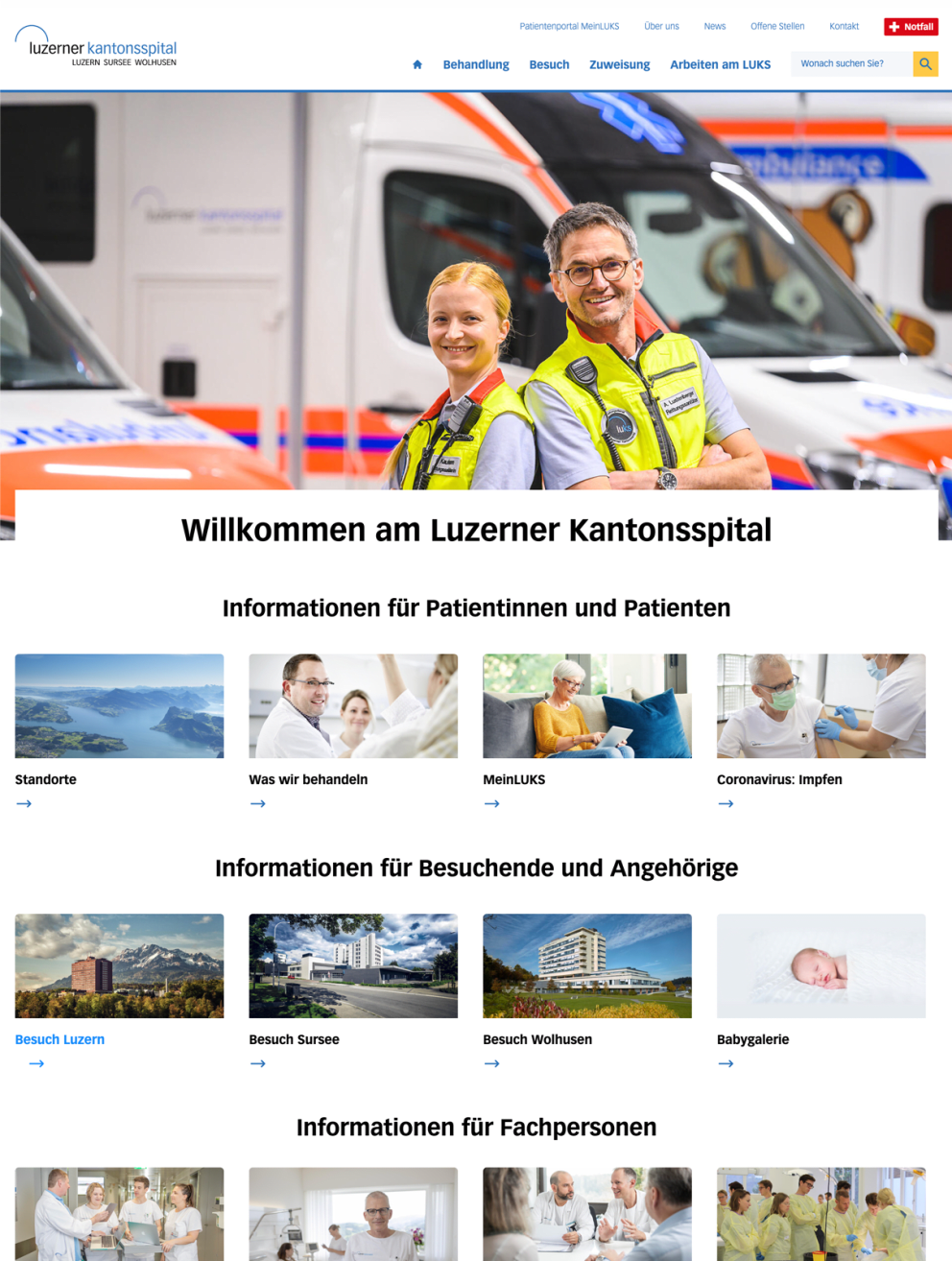
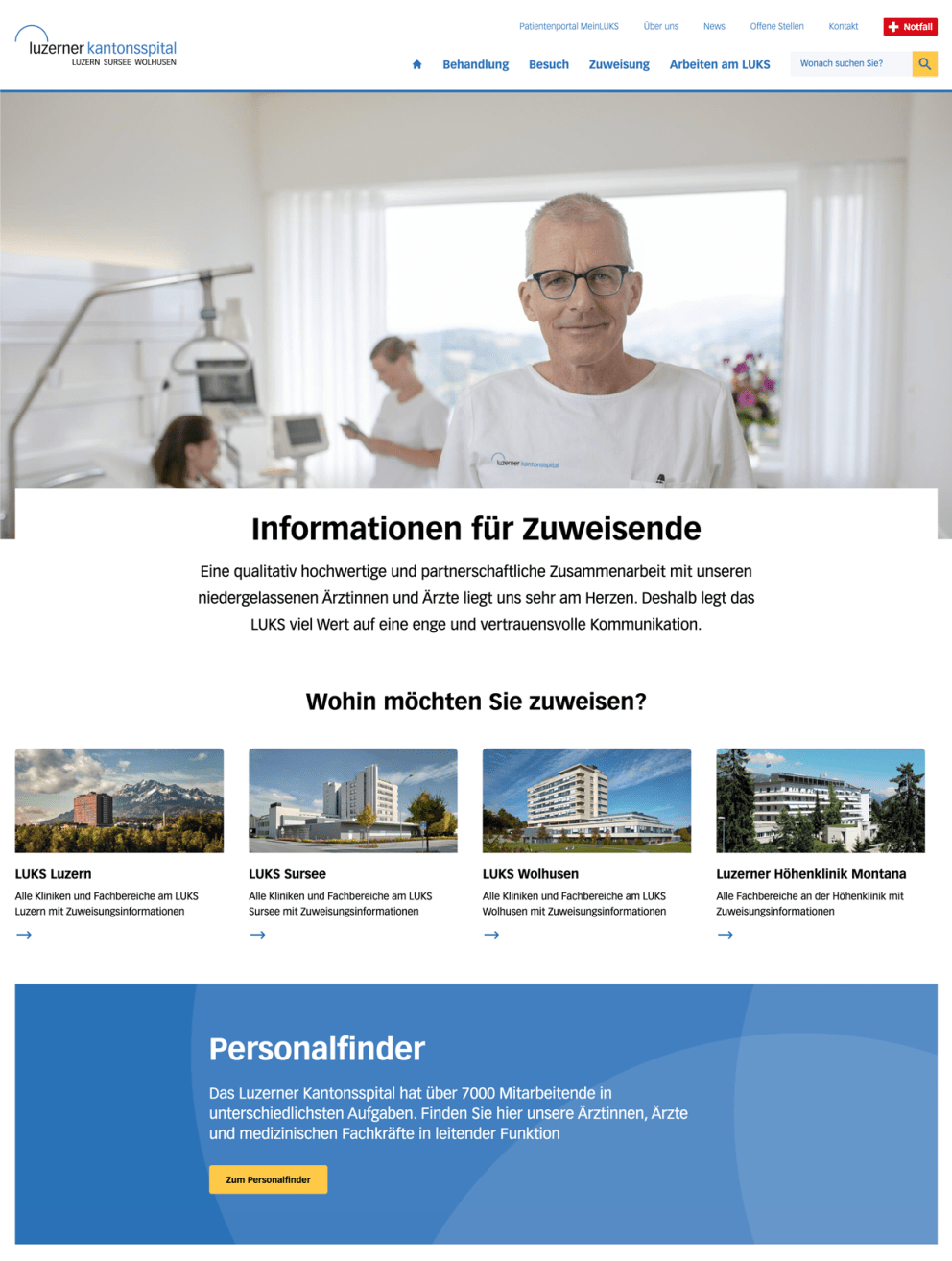
- Visually, the elements of the existing websites have been analysed and rethought.
- UX Design: By implementing new design elements, more positive emotionality can be conveyed - especially in the medical context, this aims to reduce fear and create trust.
- Research: by analysing usage data, the main navigation was restructured and given a hierarchical design. This makes it easier for users to see which topics/page areas belong together in terms of content.
- Information architecture and content accessibility concept in close collaboration with the LUKS group
The Result
- The synergies from the relaunch have resulted in cost savings.
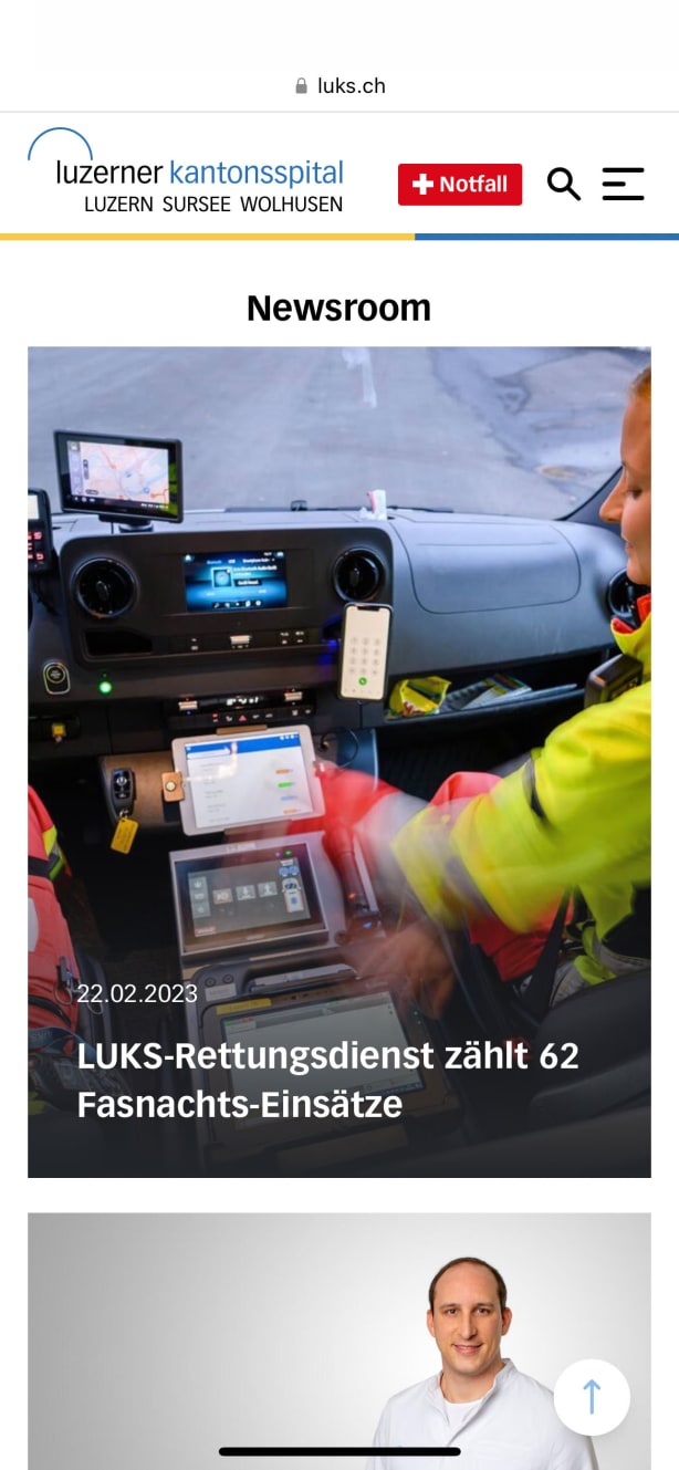
- Thanks to the more intuitive navigation, the required clicks have been reduced by 65%, and the average visit duration has decreased by 24%. This saves the population approximately 810 days of "lost navigation time" per year.
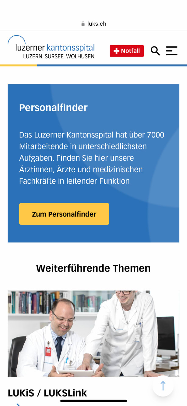
- Since 2017, the LUKS Group has conducted a satisfaction survey using the Net Promoter Score (NPS) every November. The survey in November 2022 revealed a 97% increase in satisfaction among users accessing the website via smartphones.
- For desktop usage, the satisfaction increase was 14%.
- The decoupled architecture ensures greater reliability, making the frontends more resilient and the websites accessible around the clock.
- By renewing the technical infrastructure of luks.ch and spital-nidwalden.ch, the page load time has been reduced by over half.


